GEO: Generative Engine Optimization – The Future of Search in 2026
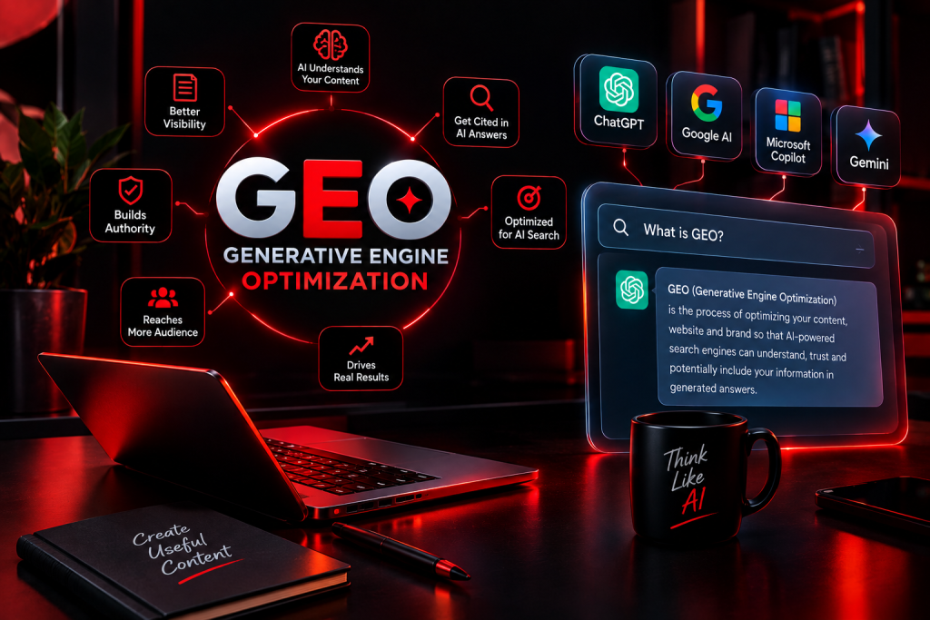
Search is changing rapidly. People are no longer relying only on traditional search engines to find information. Today, users increasingly ask AI-powered tools such as ChatGPT, Google AI features, Microsoft Copilot, and other generative search platforms for direct answers. This shift has created a new digital marketing practice called GEO (Generative Engine Optimization). GEO focuses on making your website, content, brand, and information easier for AI-powered search engines to understand, trust, and potentially include in generated answers. For businesses, marketers, and content creators, understanding GEO can help prepare their online presence for the changing search landscape. What Is GEO? GEO stands for Generative Engine Optimization. It is the process of optimizing online content so that generative AI systems can better understand, retrieve, summarize, and potentially cite or mention that information when answering users’ questions. Traditional SEO primarily focuses on improving visibility in search engine results pages (SERPs). GEO expands this approach by considering how AI-generated answers are created. GEO vs Traditional SEO SEO generally focuses on ranking webpages for specific keywords. GEO focuses more broadly on helping content become useful and recognizable within AI-generated responses. For example, traditional SEO might target the keyword: “Best digital marketing strategies for small businesses.” A GEO-focused strategy would also create clear, authoritative information that directly answers related questions such as: What is digital marketing? Which strategy is best for a small business? How much does digital marketing cost? How can businesses measure results? Why Is GEO Important? Users increasingly expect fast, direct answers instead of visiting multiple websites and comparing information themselves. AI-powered search can summarize information from multiple sources and provide a conversational response. For businesses, this means visibility is no longer only about getting a blue link on a search results page. It can also involve being represented as a source, brand, expert, or reference within AI-generated answers. How Does GEO Work? GEO works by improving the quality, structure, clarity, relevance, and credibility of content. AI systems need to understand what a page is about and determine whether its information is useful for a particular question. Create Helpful and Direct Content Content should answer the user’s question clearly. Avoid unnecessary introductions that delay the actual answer. For example, instead of writing several paragraphs before explaining a topic, provide a concise definition first and then expand with examples and supporting information. Use Clear Content Structure A well-organized article is easier for both users and machines to understand. Use: H1 for the main topic H2 for major sections H3 for supporting topics H4 for detailed subsections Bullet points and numbered lists where appropriate Short paragraphs Descriptive headings Make Important Information Easy to Find Important facts should not be hidden inside large blocks of text. Use clear headings, definitions, examples, tables, lists, and FAQs where they genuinely improve understanding. Key GEO Strategies A successful GEO strategy combines many principles of modern SEO with content designed for AI-driven discovery. 1. Focus on Search Intent Understanding search intent is essential. Identify what users actually want when they ask a question. Common search intents include: Informational Navigational Commercial Transactional Create content that satisfies the intent instead of simply repeating keywords. 2. Build Topical Authority Publishing multiple useful pieces of content around a subject can help establish a website as a knowledgeable resource. For example, a digital marketing website could cover: SEO GEO AEO Social media marketing Google Ads Email marketing Content marketing Website development Create Topic Clusters Connect related articles through internal links. A main guide can cover the broad topic, while supporting articles answer specific questions. This creates a structured content ecosystem that helps users navigate related information. 3. Provide Accurate and Original Information AI systems need reliable information. Content should be factually accurate, regularly updated, and supported by trustworthy sources when appropriate. Avoid publishing copied, misleading, or unsupported claims. 4. Strengthen E-E-A-T Signals Experience, Expertise, Authoritativeness, and Trustworthiness are important concepts in Google’s search quality guidance. Businesses can demonstrate credibility by: Providing author information Showing real experience Using trustworthy references Maintaining accurate business information Updating outdated content Publishing original insights 5. Optimize for Questions Many AI searches are conversational. Users may ask complete questions rather than typing short keywords. Instead of targeting only: “GEO optimization” you can also address questions such as: “How does GEO help businesses appear in AI search results?” 6. Use Structured Data Structured data helps search engines understand information on a webpage. Depending on the content, relevant schema types can provide additional context about articles, organizations, products, events, and other entities. Structured data should accurately represent the visible content on the page. GEO and AEO: What’s the Difference? GEO and AEO (Answer Engine Optimization) are closely related but focus on slightly different aspects of search. AEO focuses on optimizing content to provide direct answers to user questions, particularly in answer-oriented search experiences. GEO focuses specifically on visibility and representation within generative AI and AI-powered search experiences. Can SEO, AEO, and GEO Work Together? Yes. These approaches can complement each other. A modern content strategy can combine: SEO → Search visibility AEO → Direct answers GEO → Generative AI visibility Instead of treating them as completely separate strategies, businesses can create useful content that works across different search experiences. Common GEO Mistakes to Avoid Keyword Stuffing Repeating keywords excessively does not make content more useful. Write naturally and focus on answering the user’s question. Creating Content Only for AI Content should primarily be useful to people. Trying to manipulate AI systems with unnatural text can reduce quality and user experience. Ignoring Traditional SEO GEO does not replace SEO. Technical SEO, quality content, internal linking, website performance, and other fundamentals still matter. Publishing Low-Quality AI Content Using AI tools can help with research and drafting, but automatically publishing large amounts of low-quality or inaccurate content can damage a website’s credibility and usefulness. Future of GEO The future of search is becoming increasingly conversational and AI-driven. As generative search continues to develop, businesses will need to think beyond traditional keyword rankings. Successful digital marketing